Soup and Burger
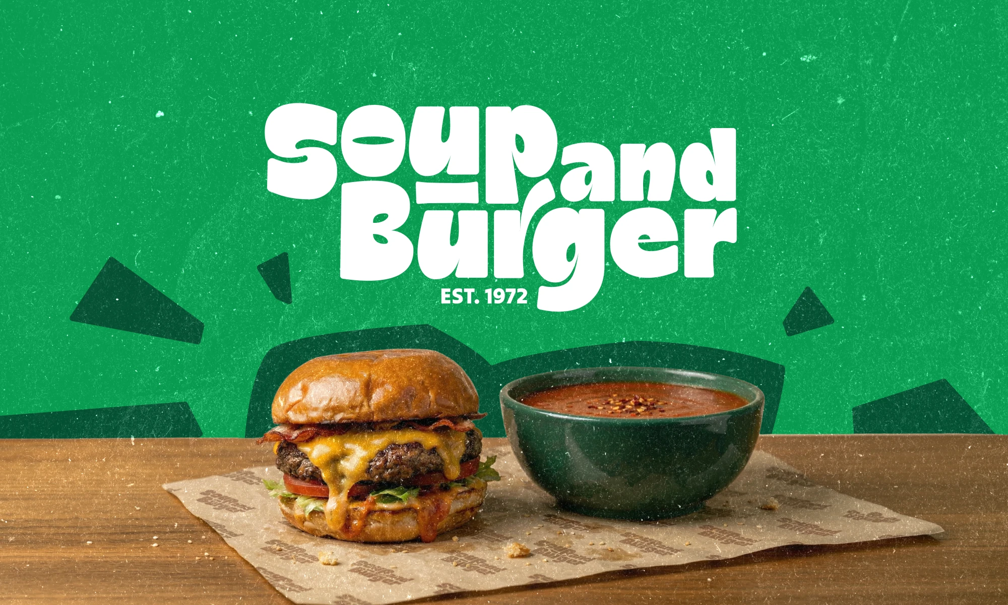
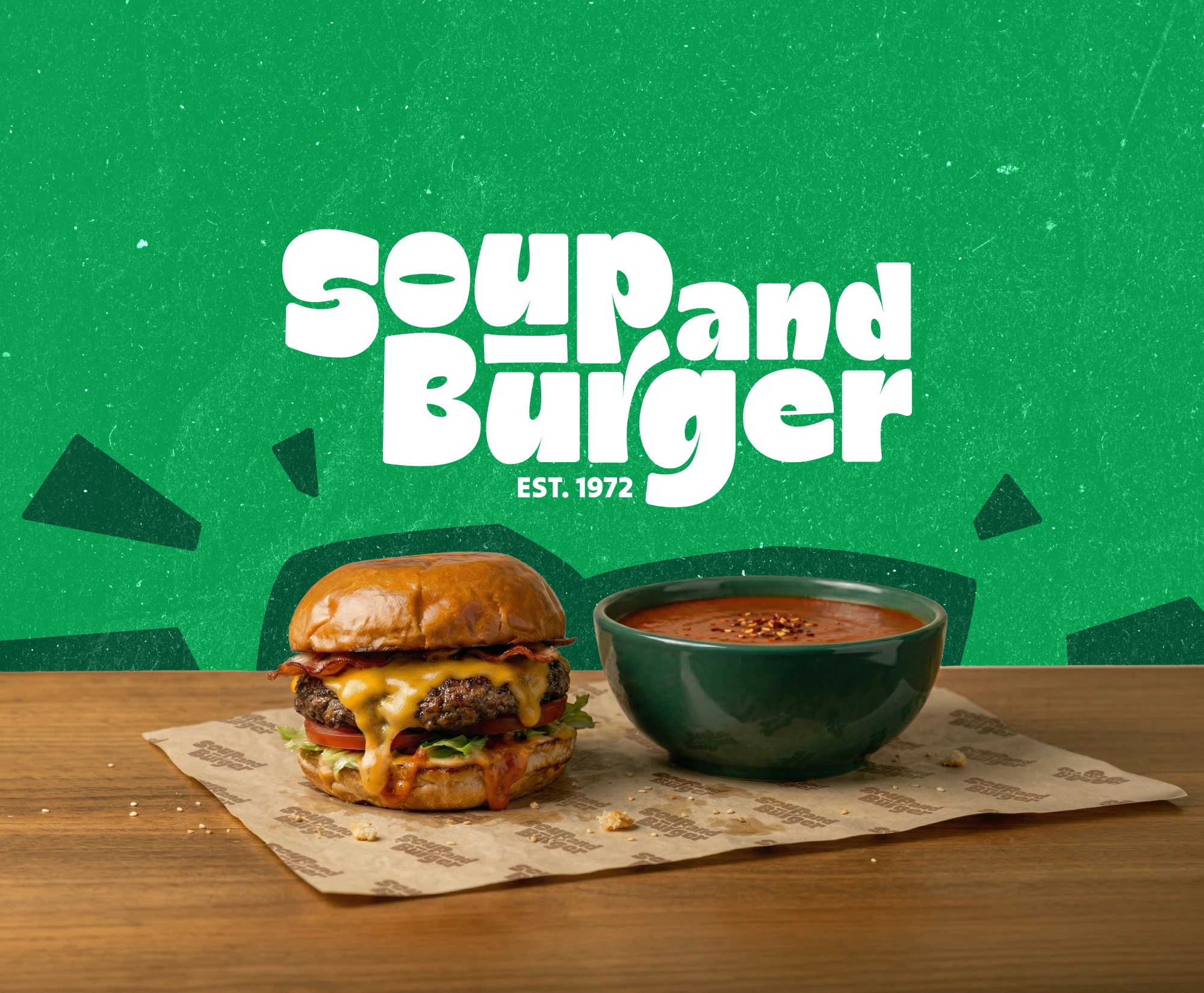
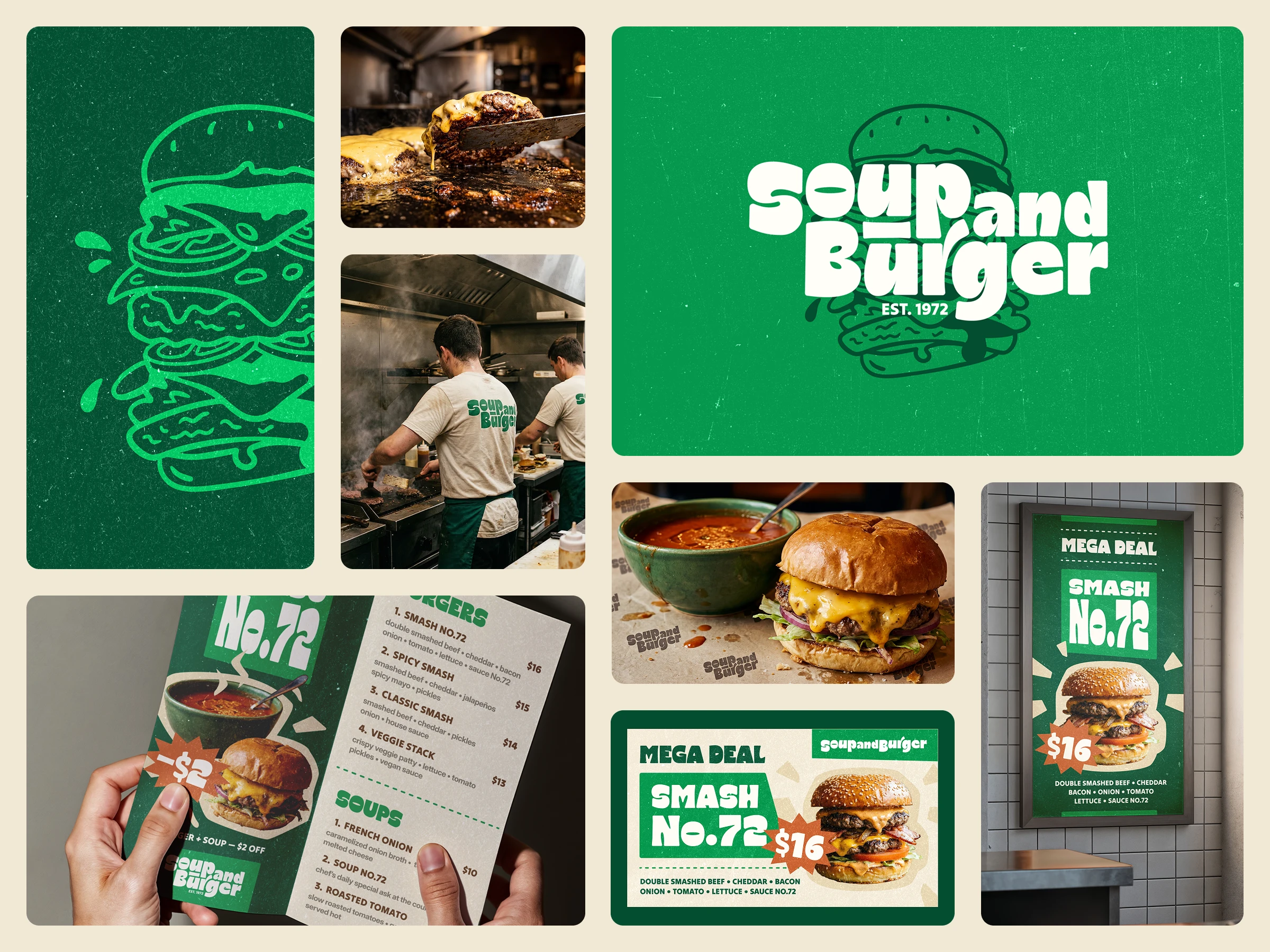
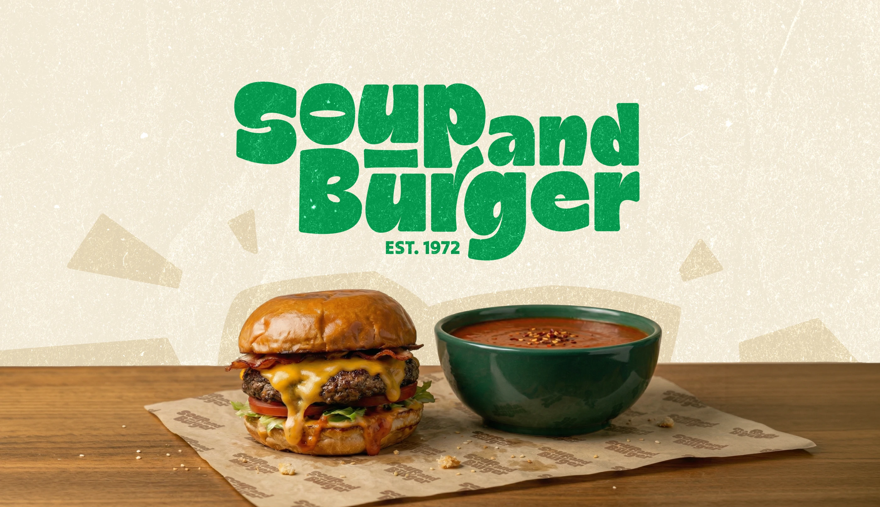
A 50 year old Brooklyn legacy and a bold and expressive brand identity, bringing it into modern times. This was created to draw attention, attract people, and bring them in.
00
problem
The brand gradually lost its ability to tell the stories of its history and character over nearly 50 years. The storefront and signage grew visually cluttered, overloaded with extraneous elements, generating noise rather than clarity. The same problem cropped up on the menu. Too many items, not structured well, too much stuff, not easy to orient oneself. While variety can seem like a feature, in fact, it only delays decisions, slows decision-making, and diminishes the overall customer experience. The brand also had no consistency across its touchpoints. No overall visual system; low memorability; no clear integration among space, packaging, signage, and communication.
solution
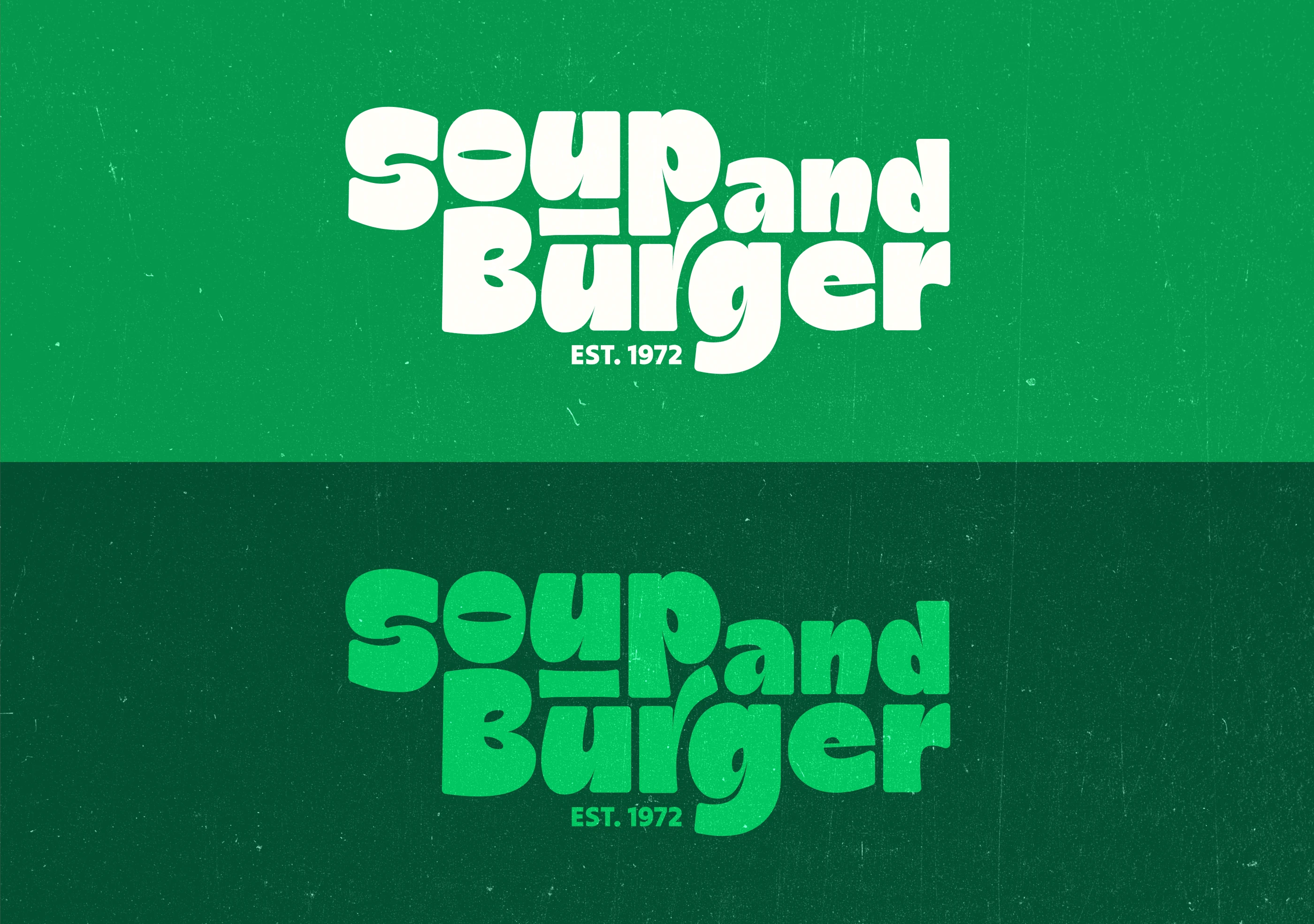
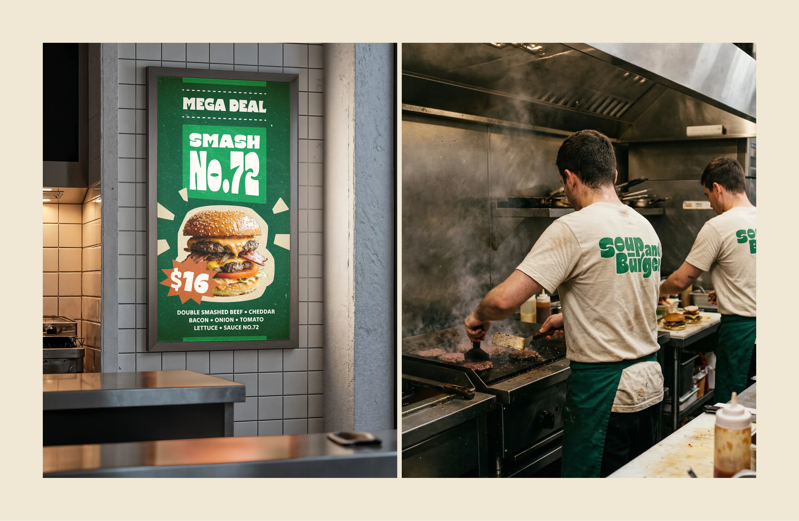
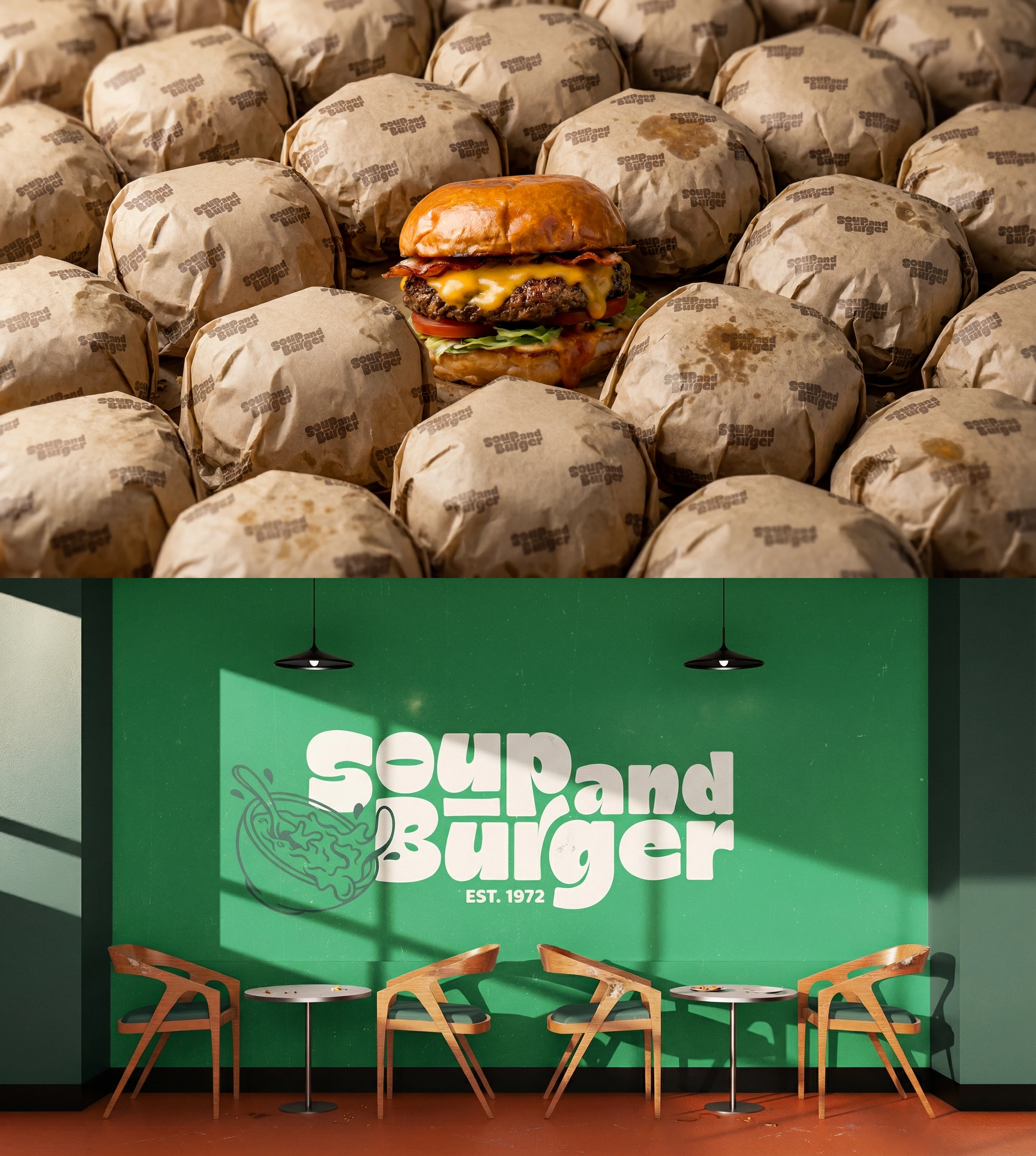
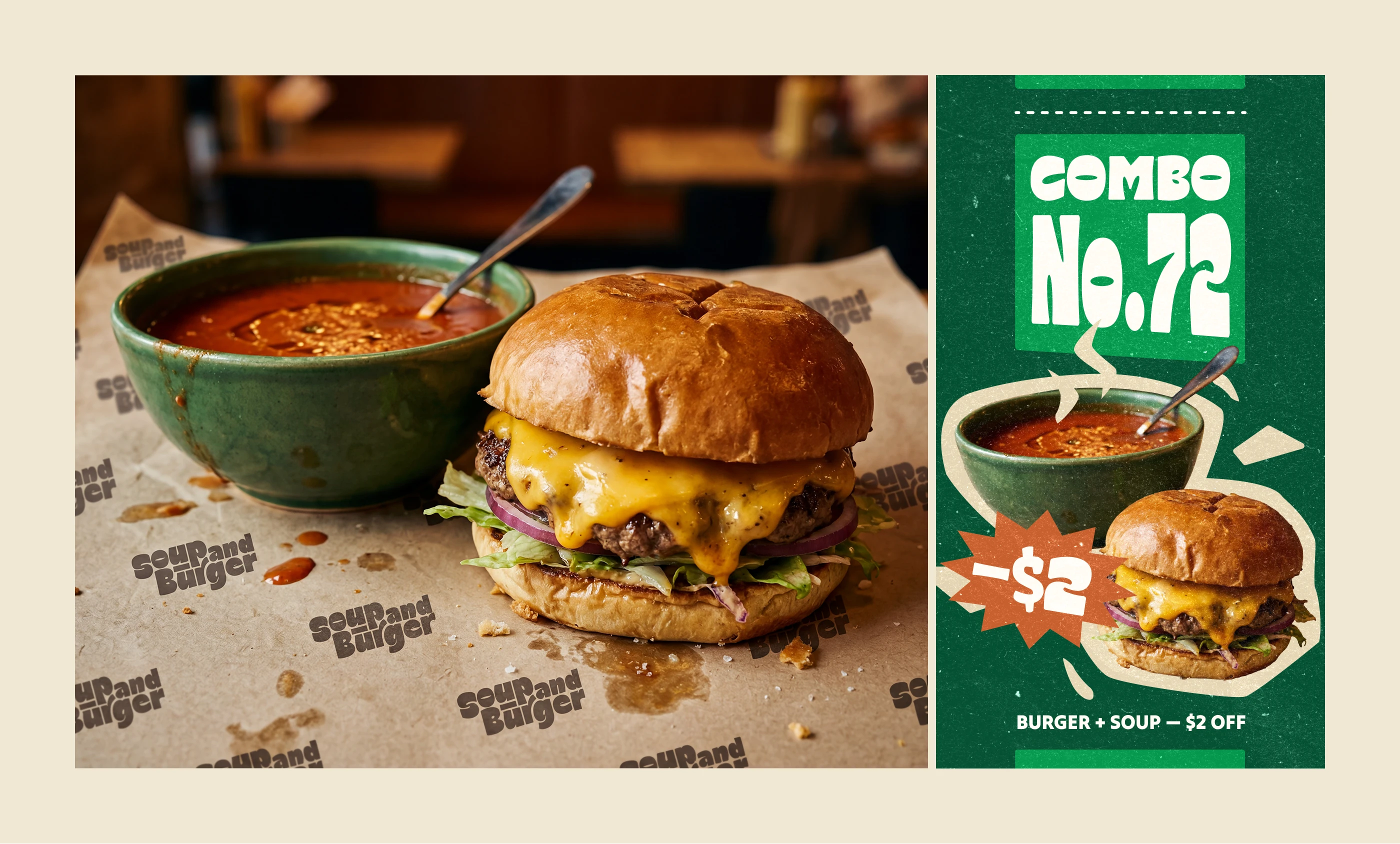
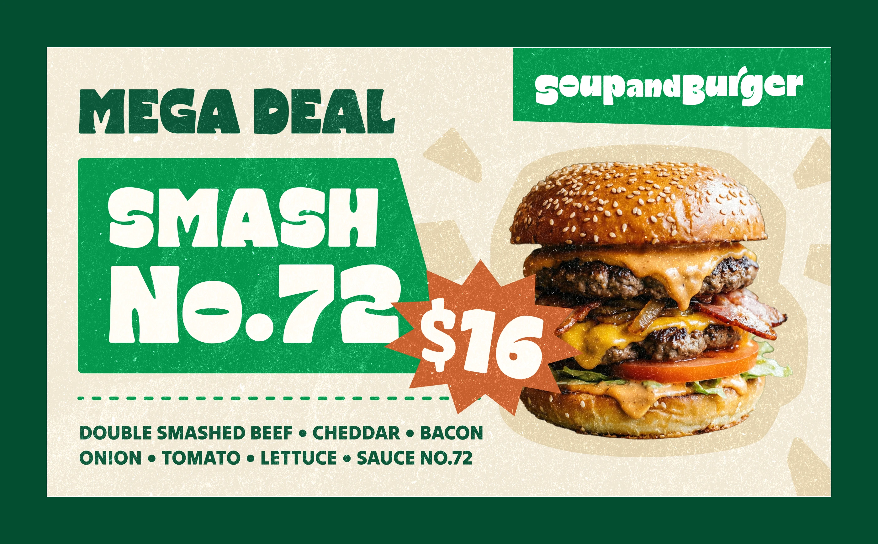
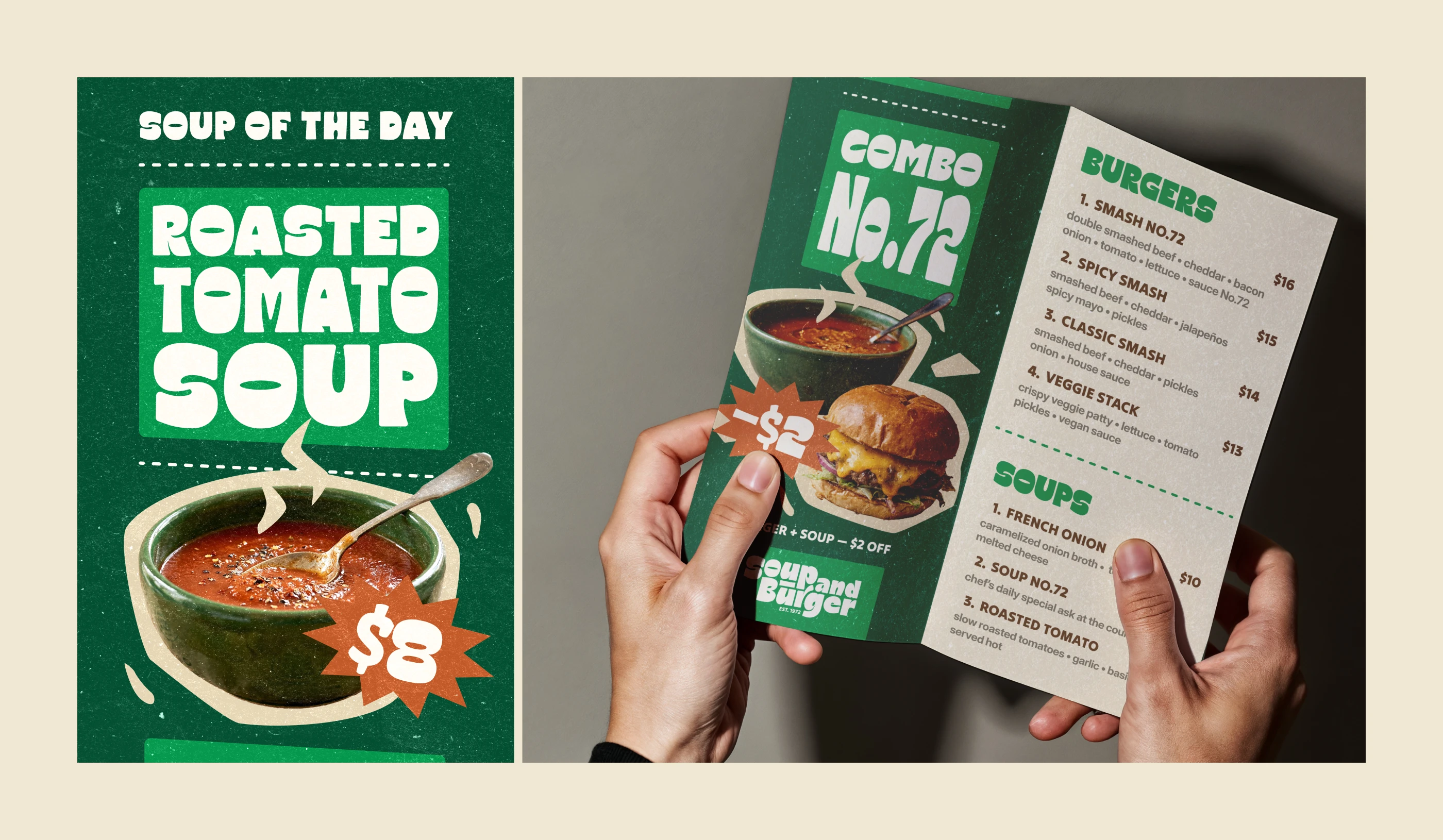
The rebrand focuses on clarity, consistency, and character. A clean, recognizable visual identity applied across signage, menus, posters, and packaging creates a cohesive brand system that’s easy to understand and remember. The menu was simplified and restructured. Fewer items, better grouped, designed to work together as complete combinations rather than isolated choices. This improves readability and speeds up decision-making. The interior and exterior were refined to reflect a more authentic, craft-driven Brooklyn vibe. It feels less polished and more real, aligning the visual language with the brand’s history.
Designing for clarity, character, and conversion
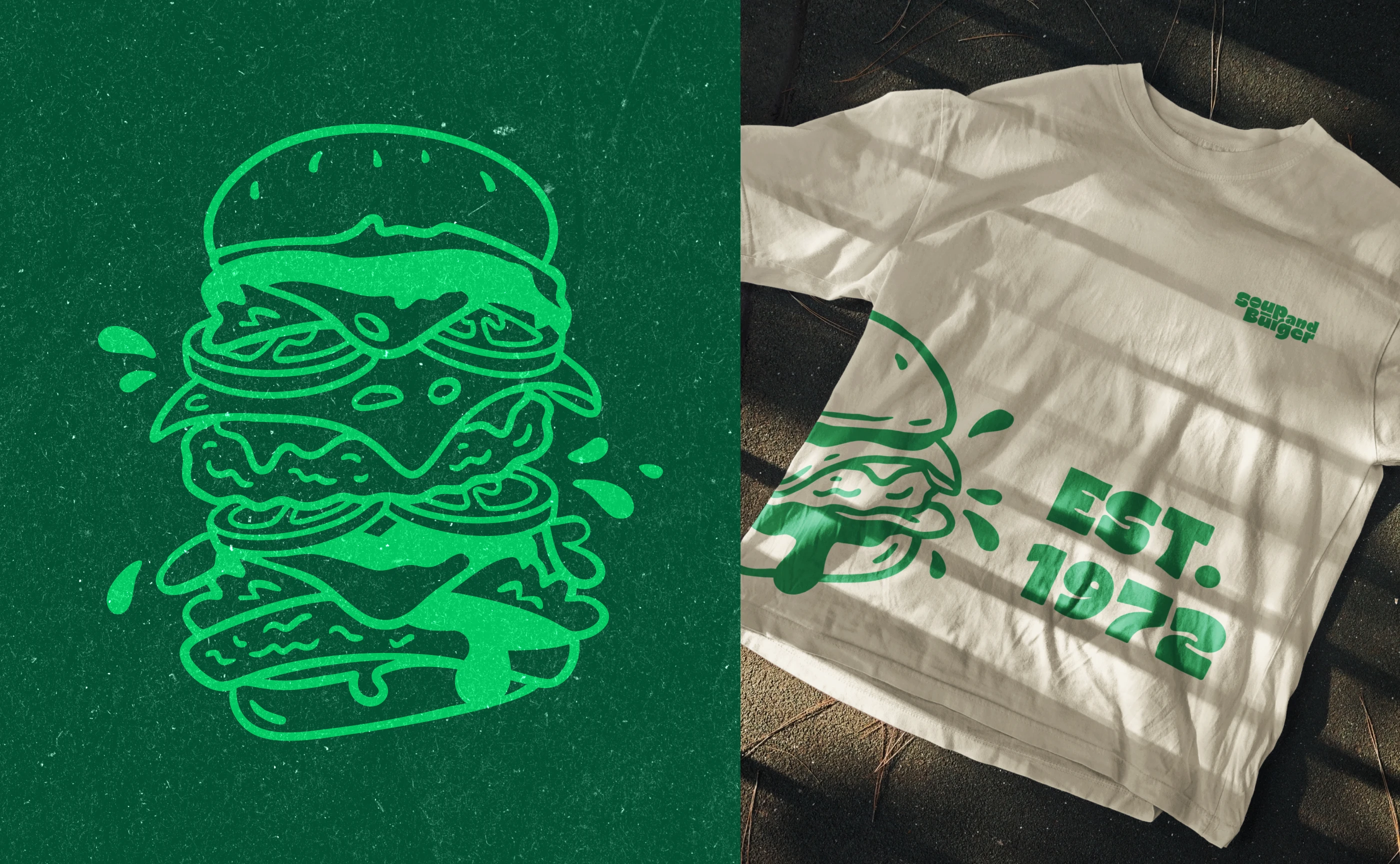
This project explores how a strong visual identity can turn a simple food place into a memorable brand through logo design, typography, packaging, and art direction.
The Business Impact
A clearer brand means faster decisions. Customers instantly understand what the place offers, feel more confident choosing, and are more likely to convert without hesitation. A focused menu reduces operational complexity while increasing perceived quality, allowing the business to serve less, but better, and ultimately charge more.
The result is a stronger, more memorable brand that attracts new customers, retains existing ones, and turns a local spot into a recognizable experience.
year
2026
timeframe
16 days
tools
Illustrator, InDesign
services
Rebranding
case study
see also